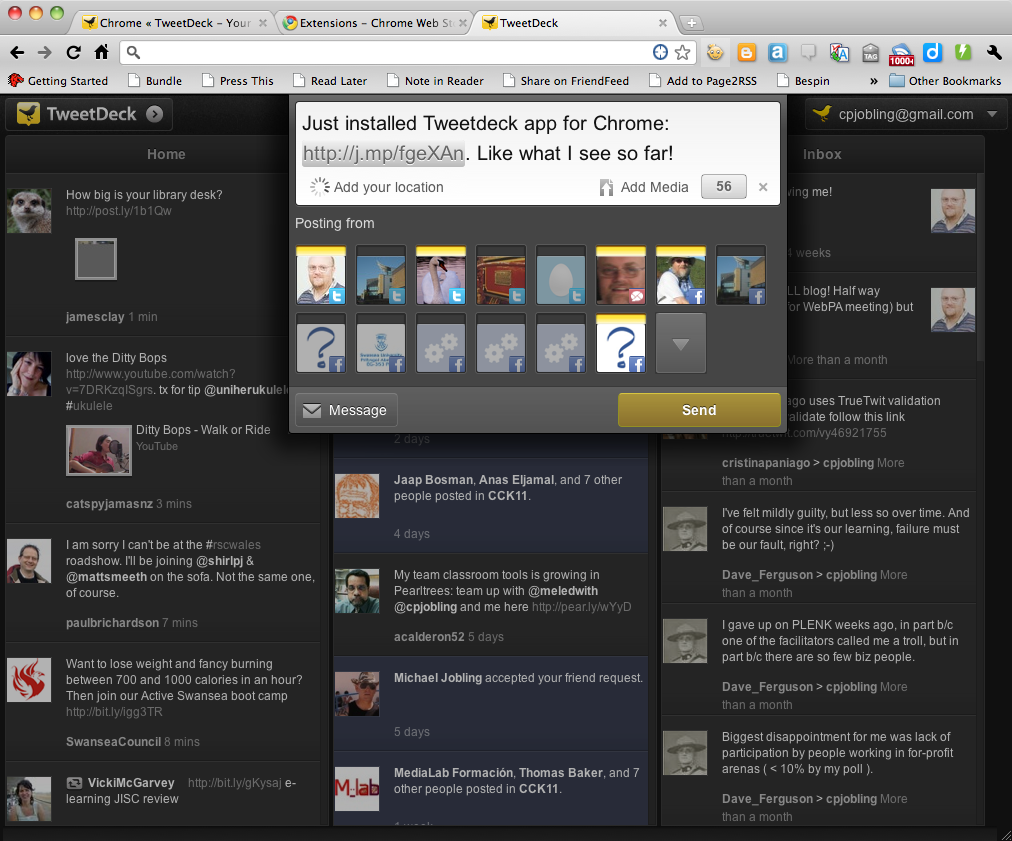
I’ve just installed the new TweetdDeck app for Google Chrome and like what I see so far. It takes the “that’s so obvious, why wasn’t it done before” idea of combining (TweetDeck calls this blending) all your feeds into three columns.
- Home: for all your identities and the people they follow across all of your social networks;
- Me: for mentions of your social identities and posts to your facebook newsfeeds; and
- Inbox: for direct messages.
Like TweetDeck the desktop app, you can add your Twitter, Facebook and Google Buzz accounts and you can post to one or all of them.
I hope that the iPhone version will adopt this interface as it’s much easier to handle the blended columns than multiple columns on the small screen.
It’s only been 5 minutes, but first impressions: 5 thumbs up!
